A brand since 1929, BABA has come a long way. To commemorate their 90th year they wanted to launch a Pan Masala for the first time. It was an exciting time for us as this was the first time, we were going to breathe life into a product in a whole new market segment. Understanding the nuances of this market was very integral to our process.
We started by exploring the market and the audience that the product would cater to. Our research gave us insight about competitors, and we understood that most pan masala brands had indifferent communication. This was the first challenge, to reflect aspiration & legacy in the product. This gave us an opportunity to brand the product with fresh perspective.
Since the parent company is an old establishment, we had to come up with ideas that would add to their existing portfolio. Understanding the people who are going to buy the product was our first step. Building a design language for the quintessential Indian consumer. We combined typographical elements & detailed decorative symbolism to showcase Indian Royalty.
LOGO
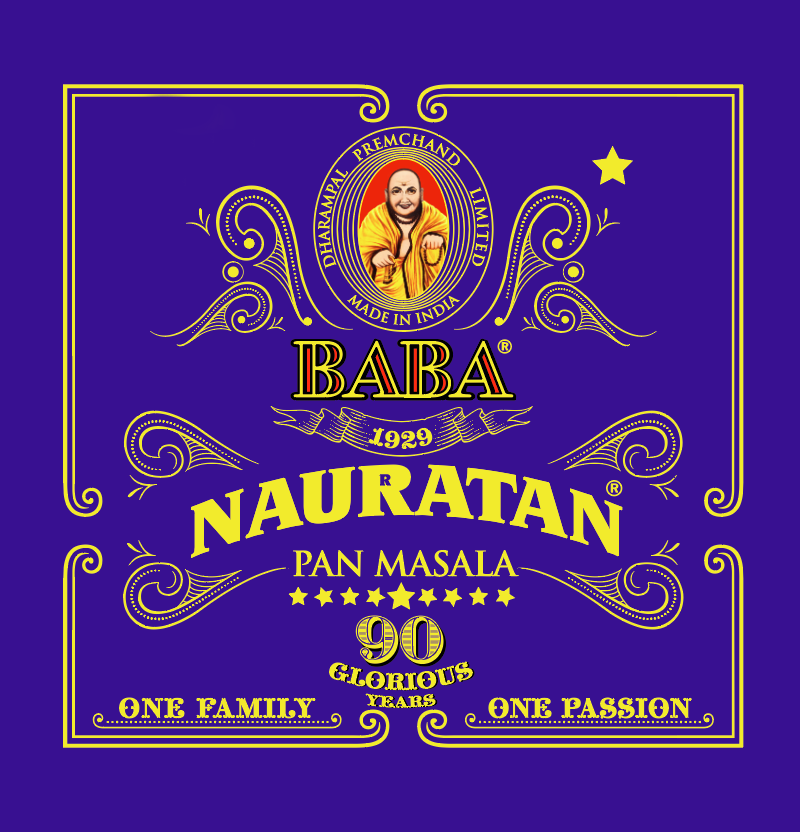
We wanted to create a logo which would be relatable for the masses. The Pan Masala has
travelled far, reaching far-flung places while experiencing various terrains. In order to keep the experience intact with the identity, we designed an old-style wordmark logo with a few decorative elements to balance it out. The Indian Peacock has a majestic blue colour which prudently displays royalty. The Royal Blue signifies nobility, depth & stability while the Yellow adds value by fashioning honour, loyalty, thrill & joy.
PACKAGING
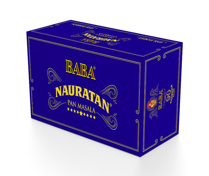
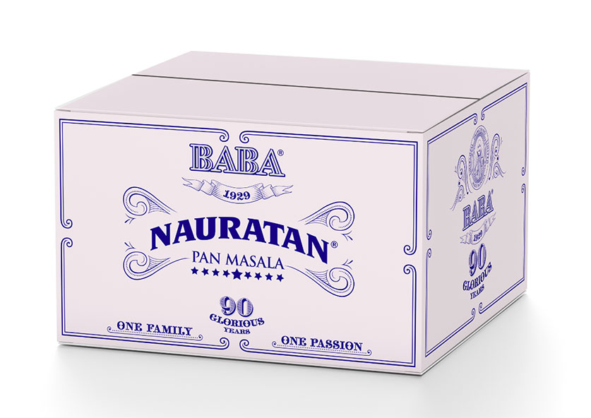
A festive product inspired by 90 years of togetherness in the Indian Market. Considering the endless range of pan masalas comprising all sizes and prices, Nauratan Pan Masala stands out among the others, elegantly.
Nauratan is available in various packing sizes to suit the needs of every consumer. There are tin cans priced at ₹ 75/- and ₹ 225/- along with sachets at ₹ 5/-, ₹ 10/- and ₹ 50/-.
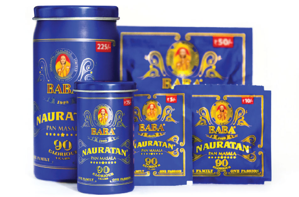
Since the Indian government banned the use of plastic for pan masala packaging in 2016,ensuring the design would be suitable on multiple materials was an integral part of our design process. The printing process on the tin foil substrate was an interesting experience for us, as it required very specific printing methods that were different from anything we had previously done.
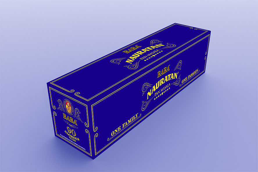
The outer cartons and inner cartons we made to reflect the brand identity and increase the recall value of the brand from afar.
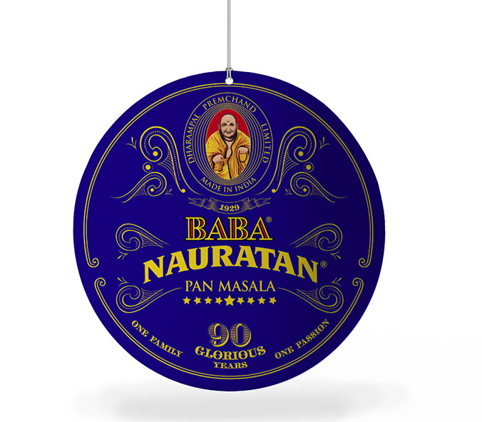
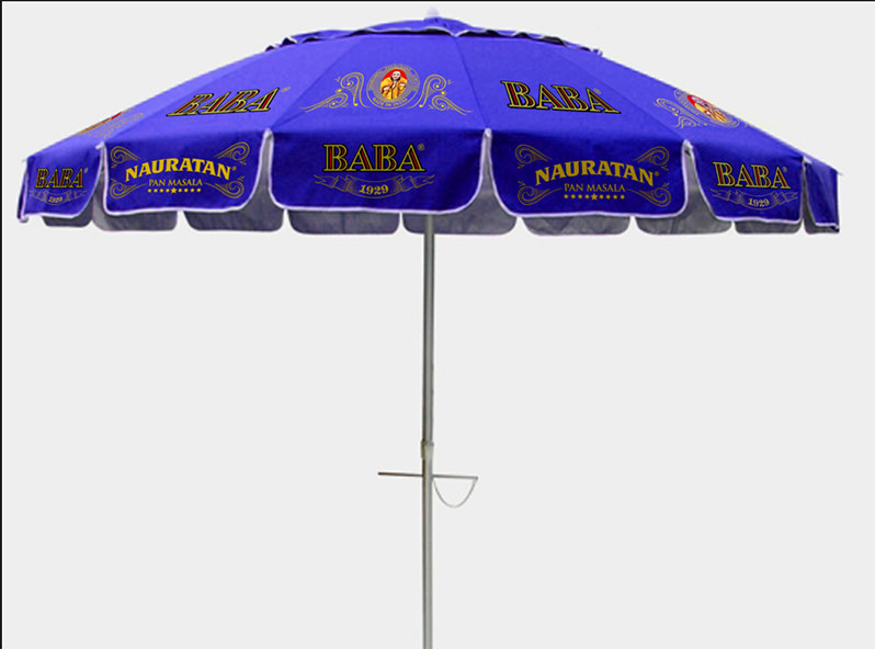
BRAND COLLATERAL
We designed danglers, pan shop boards and umbrellas as an extension to the Brand Identity for marketing purposes. Nauratan is about rejoicing with people.
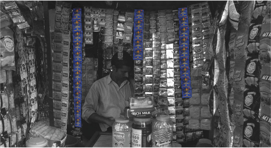
DANGLERS
NAURATAN PAAN SHOP UMBERELLA
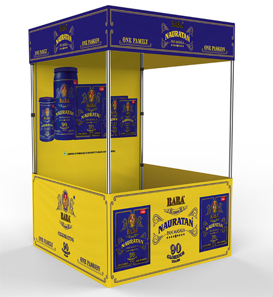
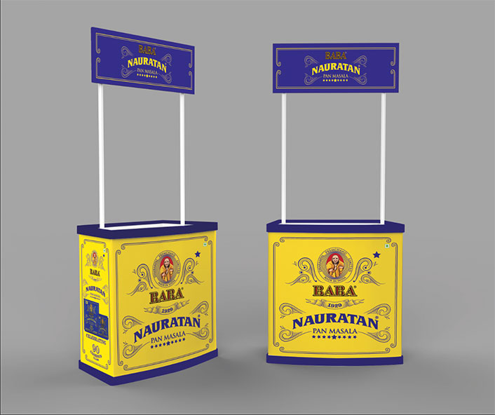
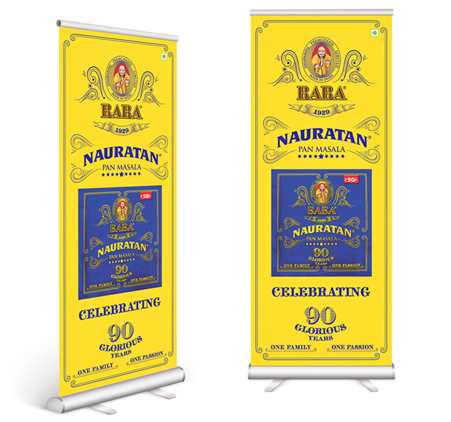
We also created additional designs for kiosks, promotional tables and standees that would be used at exhibitions or festive grounds.
NAURATAN KIOSK
PROMOTIONAL TABLES
STANDEES
If you walk around any market, you will easily spot BABA products at several pan shops, and Nauratan Pan Masala’s Indian blue shining brightly.