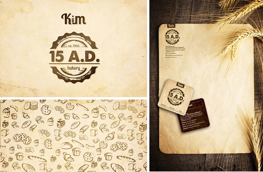
Old paper texture at the back and earthy colors like beige and brown were used to compliment the colors of the ingredients, their branding, and to be a subtle reinforcement of the natural approach they pursue in baking.
[custom_headline type=”left” level=”h2″ looks_like=”h6″]Kimsa[/custom_headline] Driving through the barren sands of Rajasthan, the only burst of colour one can spot is the odhnis of women and the turbans of men.
Having been travelling to this side of the country for so many years for different projects, we have noticed that every 100 kilometers there is a distinct style of tying the turban.
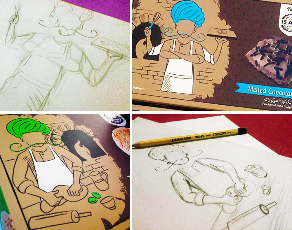
From here came the inspiration to create a character that customers could relate to -an approachable, Jodhpuri personality who is proficient, experienced and trustworthy and his pop coloured turbans came from our journeys to Rajasthan.
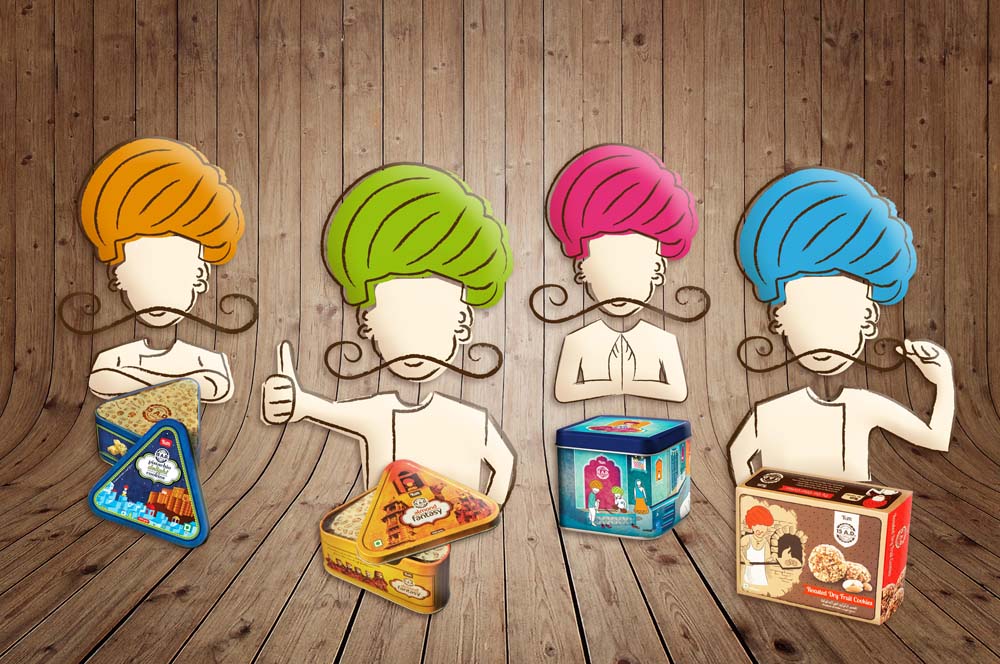
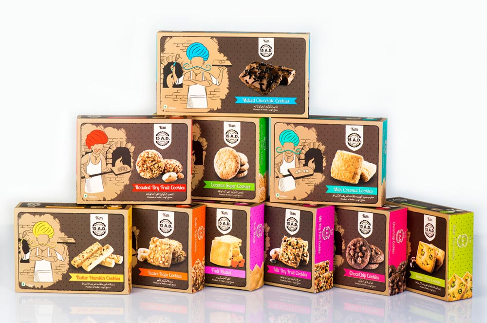
The new look for the cookie boxes has Kim Sa in a baker’s avatar. Each cookie box has been given a vibrant pop of color to highlight the flavours that compliment the cookies. We have used bright green for pistachio, purple for currant, yellow for salted etc.
 [gap size=”10px”]
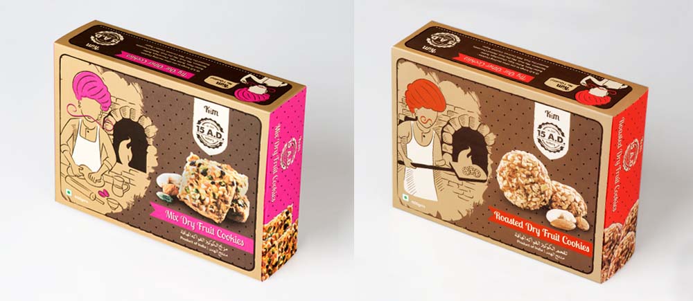
Lots of sketches were made over coffee and delicious Kim 15 A.D. cookies. Finally we zeroed in on five different avatars for Kim Sa as a baker which are printed on the cookie boxes.
[custom_headline type=”left” level=”h2″ looks_like=”h6″]Steve Mccurry[/custom_headline]
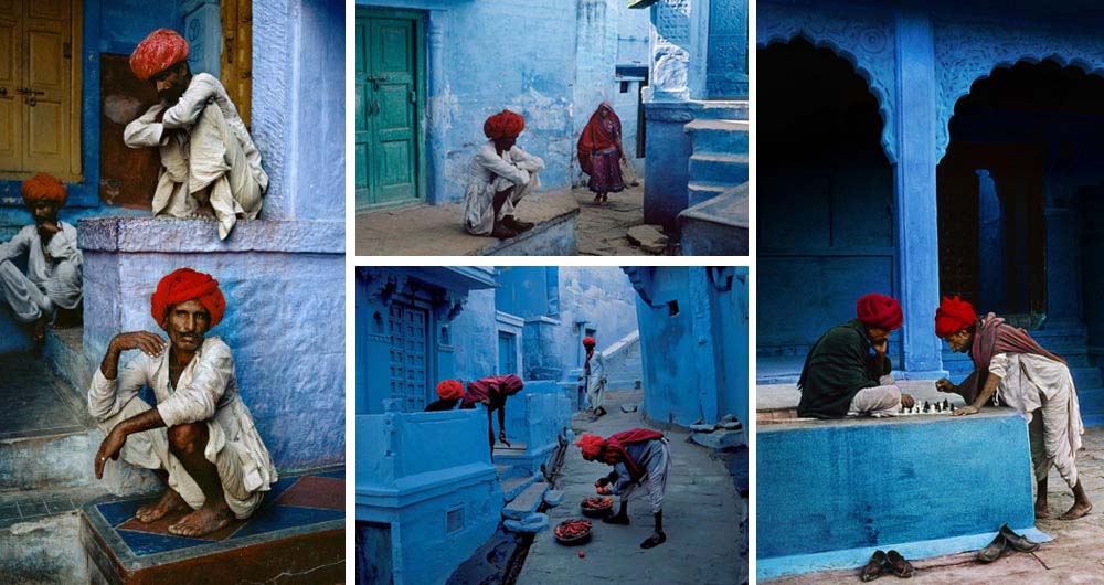
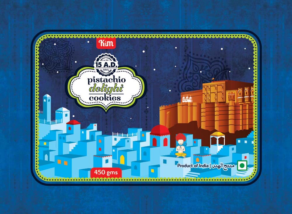
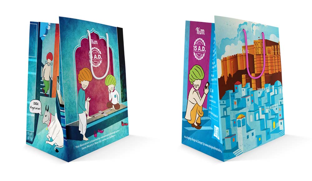
We introduced a special tin box that draws inspiration from the world renowned photographer, Steve Mccurry’s “The Blue City” series. His breathtaking photos capture the spirit of Jodhpur in its true form and colour.
 [gap size=”10px”]
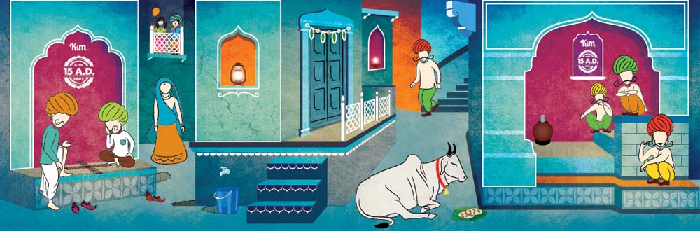
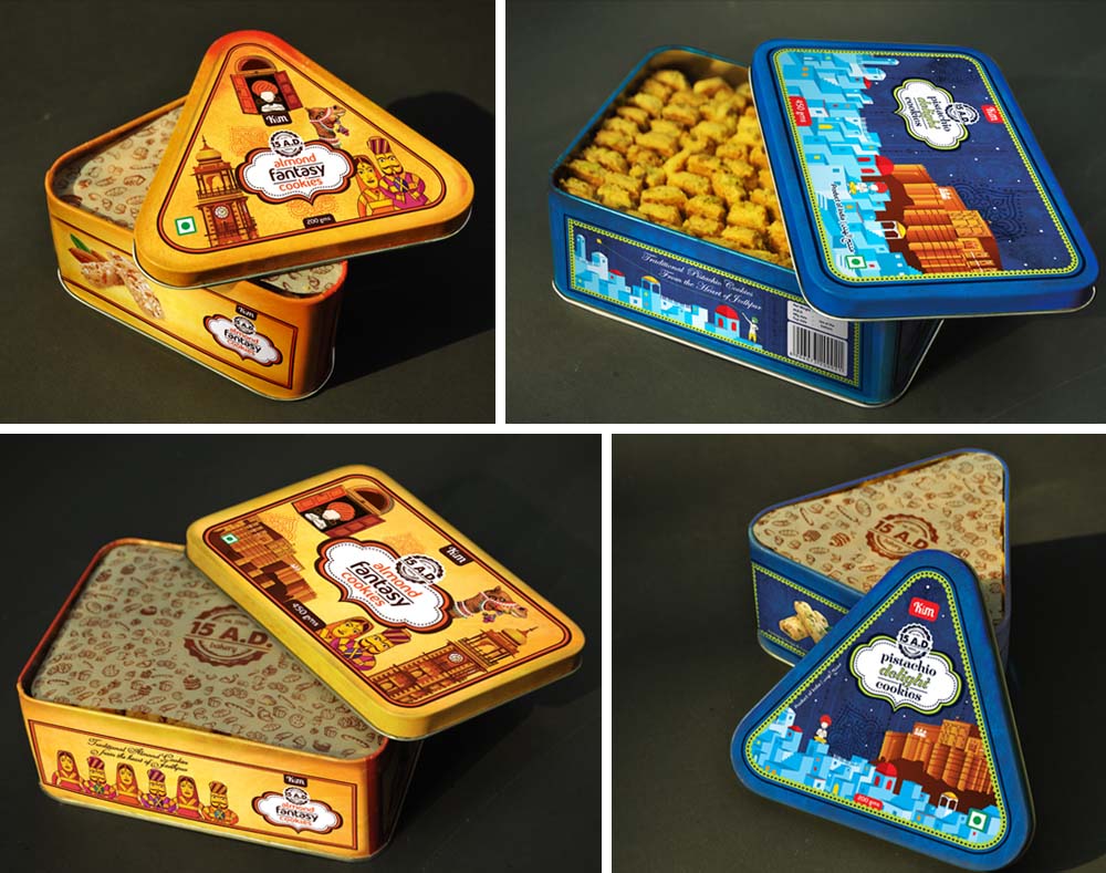
This assorted cookie tin was designed for the Kim 15 A.D. airport kiosk. Illustrated with street scenes of Jodhpur. This also serves as a keep-sake for tourists.
[image src=”https://www.designdimensions.in/wp-content/uploads/2015/11/3.jpg” alt=”Assorted Cookie Boxes” type=”thumbnail” style=”border:none;max-width:500px;”]
[custom_headline type=”left” level=”h2″ looks_like=”h6″]Tin Boxes[/custom_headline]
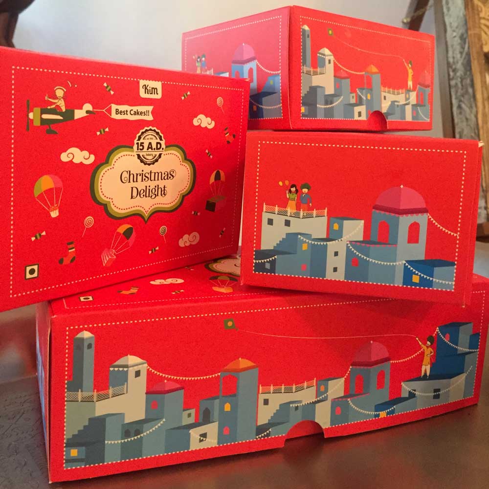
These special cookie boxes are inspired by the cityscape and famous landmarks of Jodhpur, like the Mehrangarh Fort and the Clock tower.
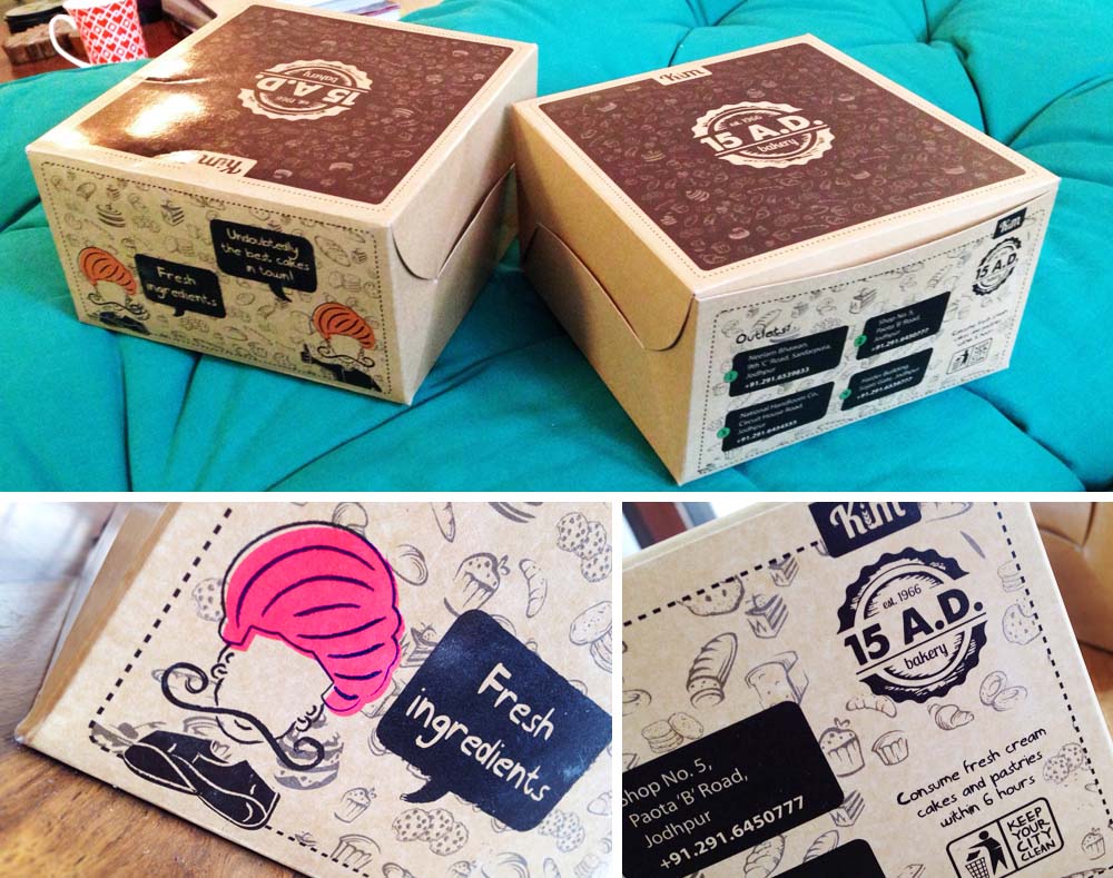
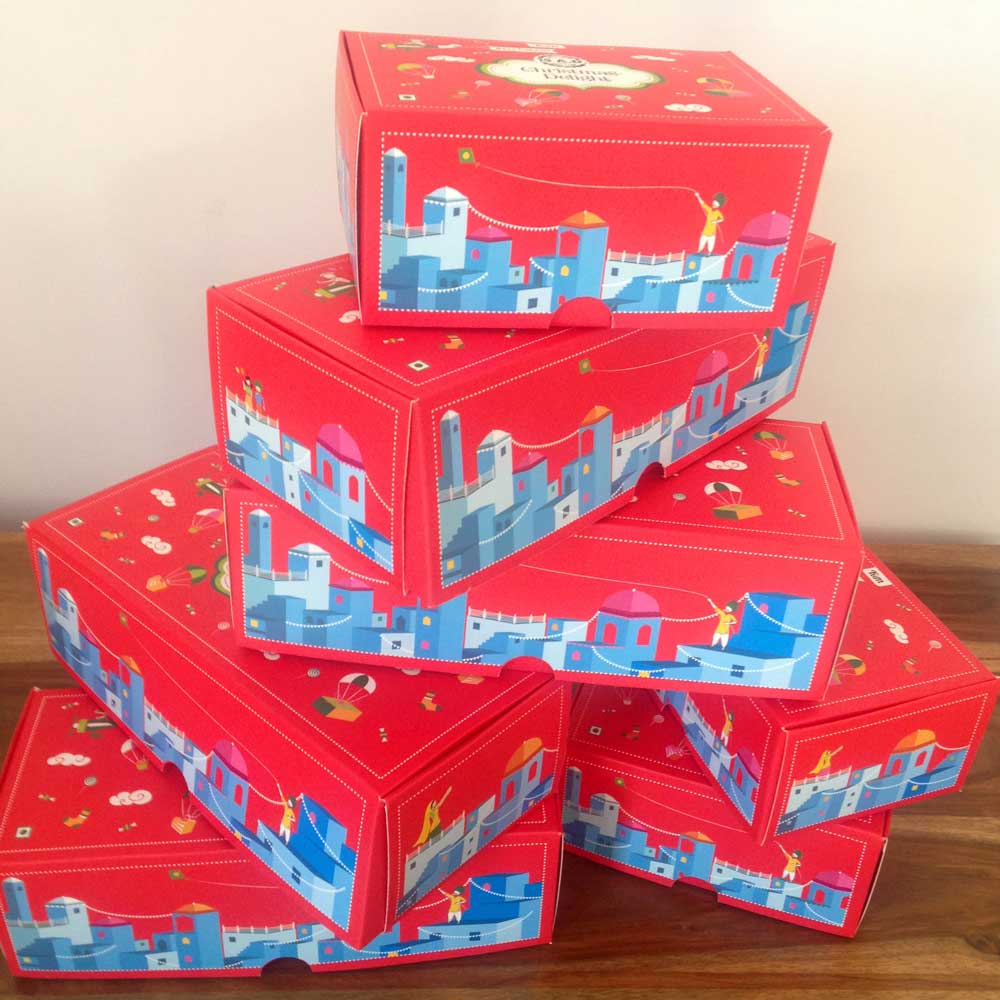
[custom_headline type=”left” level=”h2″ looks_like=”h6″]Snack Box[/custom_headline]
The pattern on the snack boxes is designed keeping in mind the Kim 15 A.D. product line.
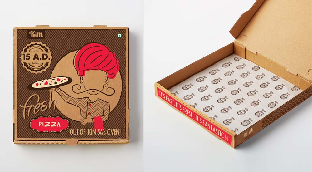
[custom_headline type=”left” level=”h2″ looks_like=”h6″]Pizza Box[/custom_headline]
Fresh out of Kim Sa’ s oven !
[custom_headline type=”left” level=”h2″ looks_like=”h6″]Paper Bags[/custom_headline][gap size=”20px”]
The Kim 15 A.D. bag is inspired by the signature blue houses of Jodhpur.
Overall, the 15 AD experience has been enriching. Playing with a myriad of colours and challenging ourselves to create something of International standards that would stand out in a city like Jodhpur.
[custom_headline type=”left” level=”h2″ looks_like=”h6″]Exhibition Kiosk[/custom_headline][gap size=”20px”]For the exhibition, we wanted to create a premium kiosk that was eye-catching and engaging. We decided to design and create a space that would carry forward our ode to Steve Mccurry’s “The Blue City” series, which in itself is renowned, visually distinct and phenomenal.
By experimenting with premium materials and form, the design pushes the boundaries of what is expected of a kiosk. We created a canvas background with wooden todis and Rajasthani mehrab shaped niches that served as display areas for the cookie boxes. Jodhpuri staircases were installed which served as display areas, seating and a photo-op area.
Acrylic pop up cut outs were used as accents on the walls of the canvas kiosk to uplift and enhance the design.
A story flows through the entire graphics of the kiosk, which also conveys relevant information to the visitor like the city of origin, store outlet addresses, cookie ingredients etc.
Kim Sa’s character was placed on top of the stall to give it a greater presence and attract visitors and clients from afar.
Our purpose for creating a canvas kiosk was that it could be dismantled with ease and stored without occupying too much space. Easy to store, easy to transport, easy to install.
[custom_headline type=”left” level=”h2″ looks_like=”h6″]Airport Kiosk[/custom_headline][gap size=”20px”]
A cupboard that transforms into a shop. The airport kiosk was designed like a cupboard that is portable yet safe and opens up to be a shop.
The cupboard has a jaali pattern engraved throughout with two laser cut brass logos on either side. It has antique handles, famously known as “kundas”
The cupboard opens up to mehrab niches inside and shelves on either side for display. Below the shelves, we have designed storage units.
Here too, Kim Sa stands tall above the cupboard to give the kiosk a grander presence.